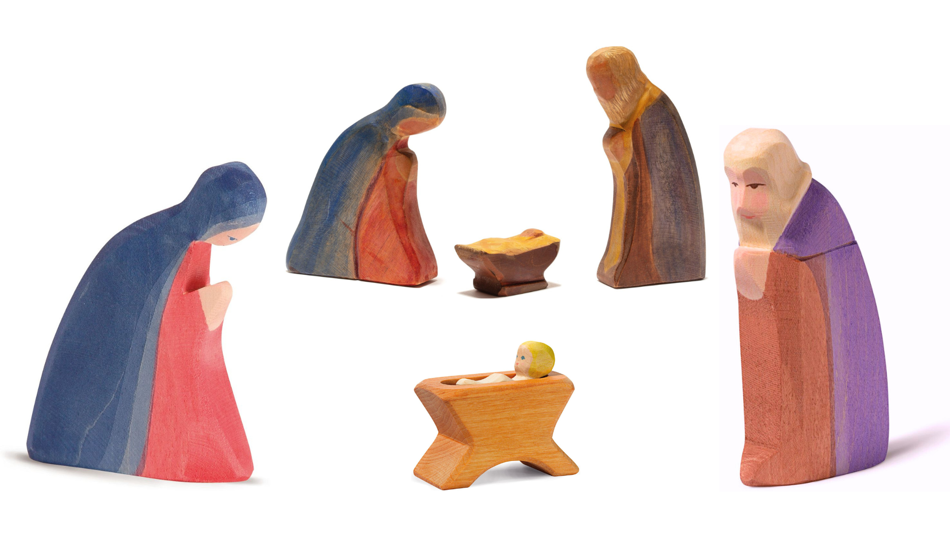
Ostheimer Design - A Unique Design Language
The typical design of Ostheimer figures
Silhouettes are sawn out of solid wood boards and artistically formed into three-dimensional figures through shape and bevel grinding on a sanding wheel. A clear, simple form language is created that allows the characteristic nature of an animal or a person to be experienced in their movement. According to Margarete Ostheimer, painting them by hand gives the figures their soul. Thus, figures are created that are lovable and able to inspire inner images through their simplicity and grace. They come to life in the viewer's experience. This design impulse has been behind Ostheimer wooden figures from the beginning until today. And yet Ostheimer figures have developed over the decades – a fact that was always encouraged and welcomed by the founder Margarete Ostheimer.
Margarete Ostheimer's Design (1959 – 1995)
The Ostheimer family had been making wooden toys by hand since 1939, but the typical Ostheimer design with its artistically handcrafted solid wood figures was only created in 1959 under Margarete Ostheimer. As designer and company owner, she shaped the collection of Ostheimer wooden figures until 1995.

Ostheimer Design under Stephan Zech (1995 – today)
Continuing Ostheimer's distinctive style, Stephan Zech, Margarete Ostheimer's nephew, has been working as the designer of our wooden figures for more than 25 years. He learned the “handcraft” from scratch by working in the production of Ostheimer figures for many years. Under him, the range was revamped and continually supplemented with beautiful new products. Not only many animals, but also all the castle and fairy tale characters in our current collection were designed by him.

A Classic in Changing Times – our Horses
The design changes to the Ostheimer horses in the last few decades are a good example of how the design of our figures can be adapted to the times and how the characteristic and typical features of the animal, for example, are unmistakably preserved.
The 1960s - Design by Margarete Ostheimer

The first horses show a free, non-professional, very simplistic way of shaping and colouring. The shape of these horses with their relatively large heads and eyes as well as their colouring (red horses) are designed for children and for the way they perceive and use their imagination. The painting is simple. Opaque colours are used and the figures are treated with varnish.
The 1970s and 1980s - Design by Margarete Ostheimer
The form design keeps mostly unchanged, but it becomes more professional. The awareness of the market develops and for the customer’s rising expectation of a professional serial production.
There is also a stronger consciousness of the grown-up customer and his perception of Ostheimer figures. The painting becomes more realistic in some models – the red horses are replaced by brown ones for example. Wood as a natural resource is important to people in the 1980s. At this time we start to use translucent wood stains for colouring and oil instead of varnish, so that the wood feeling is preserved.
Ostheimer becomes a trademark: at first the figures are marked with a sticker, later on they carry a seal that is burnt into the base.

The early 2000s - Design by Stephan Zech

It is the time when educational toys are in vogue, children are sent to school much earlier and the intellectualization of childhood begins. Toy manufacturers are confronted with less imagination-oriented customers (children and adults alike). This is reflected in the new group of horses.
Shape and painting become more delicate and expressive. The proportions are more realistic and give more credit to an adult view – the heads of the animals are smaller, details are illustrated: the hooves are being modelled, the ears are carved out much more, and even holsters are now put onto our figures.
The bridging is successful. The typical Ostheimer design is preserved. There is still plenty of room for imagination. The endearing look of our horses stays alive, and still our horses are much more enlivened than other toy figures.
But the handcrafted production becomes much more time-consuming and the delicate shapes – especially the ears - cause more breaking problems.
The Re-Design in 2019 - Stephan Zech
The death of Margarete Ostheimer and the intensive appreciation of many people especially for our old figures causes us to pause and look back to the beginning of Ostheimer Design: our horses undergo another re-design.
The new design that Stephan Zech develops in 2019 is reflecting some of the traits of the first Ostheimer horses, combining their simplicity, stability and childlike manner with a livelier form and a more elaborate colouring. With their lovable expression, the new Ostheimer horses strongly speak to the imagination of children and adult observers. They correspond with the inner child, seeming even more alive. Being carefully hand-crafted like all Ostheimer figures, they meet all contemporary quality standards, and they are much less likely to break than their delicate predecessors.

